projects
portfolio of professional works
printables
digital downloads available on etsy

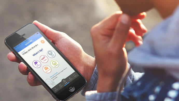
quitSTART is an ADDY© award-winning app to help teens (and adults, too!) quit smoking. The app was made for Smokefree.gov, a program created by the National Cancer Institute. quitSTART provides tips, motivation and general information about how to prepare to quit or manage cravings. It also helps track progress, earn badges and share accomplishments. It features custom games and challenges to help distract the user when these cravings hit.

When the team first kicked off this project, we had a lot of ideas on how an app could be an effective tool to help people quit smoking. We wanted the app to be health-focused, positive and tailored to the user. More importantly, keep the user engaged through gamefication, stay entertained with fresh content and keep logging their progress. The team had some idea that we wanted to take the card-style approach, but weren't quite sure how to manage and deliver the different types of content.
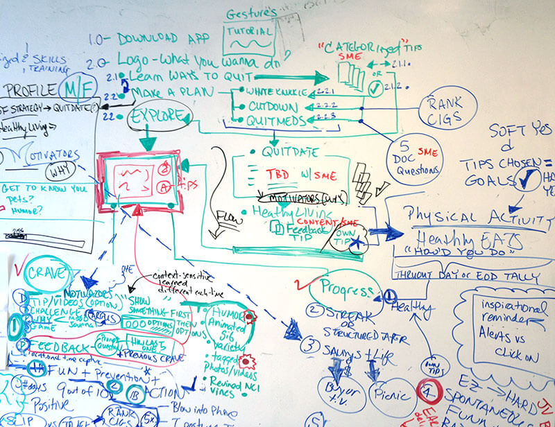
At first, it was a mess. Some of our ideas were complex and a little lofty. But if we couldn't make the functionality and flow of the app intuitive for the user, then we had to scrap the idea. And if we couldn't make the app easy to use for someone who is probably on edge to begin with, then it wasn't worth forcing. In fact, it might drive the user to do the exact opposite of what we wanted.
We did eventually manage to simplify and edit our ideas from the whiteboard and start putting together a more cohesive flow. Whiteboard notes were eventually turned into a graphical outline and once we were satisfied with the overall idea, we drilled down into wireframes.
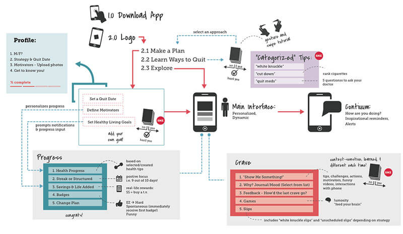
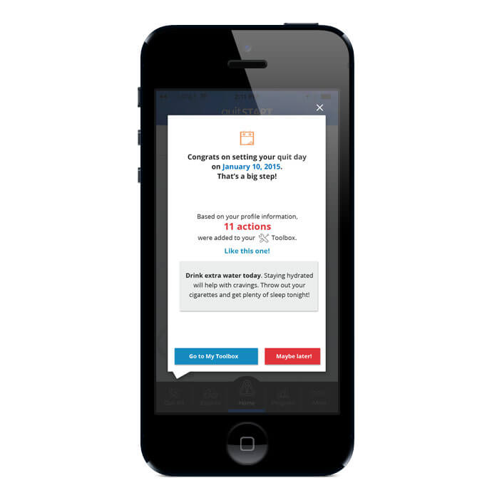
There was some complication with the two main functions of the app. One was to deliver immediate content by allowing the user to let the app know if they were having a craving, if they slipped, needed a distraction or wanted to journal. The other function was to set the user up with personalized toolbox of actions and tips the user could take depending on when they were more likely to smoke, what their typical triggers were, or what their core motivation was. For a first-time user, should we send them to their toolbox or should we allow them to choose their actions? What should be the "home" screen? There were two schools of thought with this, as our subject matter experts said that the toolbox and creating a personalized quit plan was essential to success. However, that didn't provide the user to access fresh content right away. We definitely did not want the user to have to go through a tutorial before they could start accessing the app.
The adopted solution was to show the first-time user, in the form of one overlay where the toolbox was, a sample of their personalized content and allow them to check it out right then, or to dismiss it and come back to it later after they had time to explored the app. It ended up being a super simple way to make both parties happy without the least amount of burden to the user.
Other features the app includes are badges for different milestones the user might earn, such as using the app frequently, saving money by avoiding cigarettes or just maintaining their effort to stay smokefree. There is also the ability create a journal and upload pictures about their progress. Another feature is a dynamic infographic about their stats called the "brag" screen that the user could share out to their friends via social media.
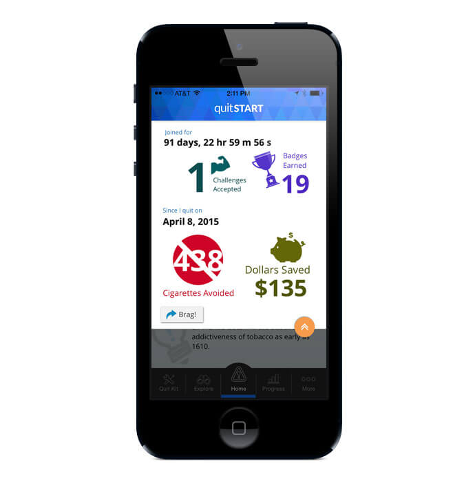
Other features the app includes are badges for different milestones the user might earn, such as using the app frequently, saving money by avoiding cigarettes or just maintaining their effort to stay smokefree. There is also the ability create a journal and upload pictures about their progress. Another feature is a dynamic infographic about their stats called the "brag" screen that the user could share out to their friends via social media.
The team also had a great time designing the games featured in the app under the "Distract Me" option. All of the games had a different look and feel to allow for some variety within the app. We pulled other designers, not directly on the project, and gave them the opportunity to put their own style to some of the game graphics. Coming up with different concepts and names for the games were a fun departure from figuring out the other logistics of the app.

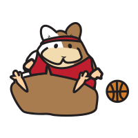
While some games are clearly modeled after other well-known games, we did come up with our own absurd ideas. Such as a hamsters that shot basketballs out of its mouth at you.
Check it out in action:
quitSTART is currently available to download via the App Store and Google Play.


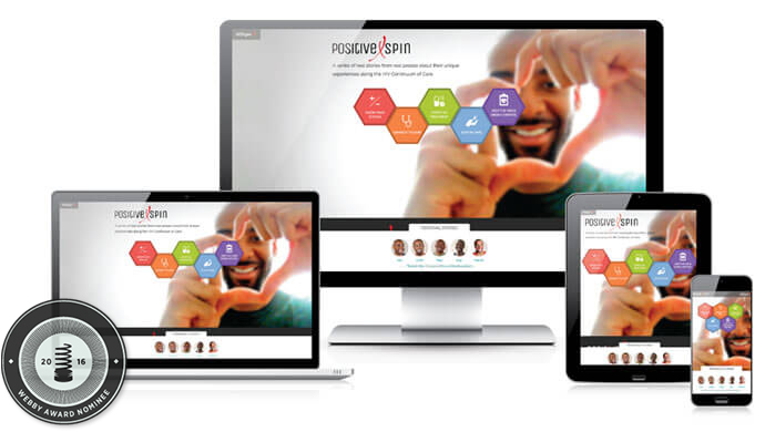
Nominated for a 2016 Webby Award as one of 5 best sites in the world for Government and Civil Innovation, Positive Spin is a microsite created for AIDS.gov to highlight the HIV Care of Continuum. Also called the HIV Treatment Cascade, it outlines the steps one takes from being diagnosed with HIV to living a healthy life with the virus being virtually undetectable. Unfortunately, while only 86% of people with HIV are diagnosed, only about 30% reach viral supression.

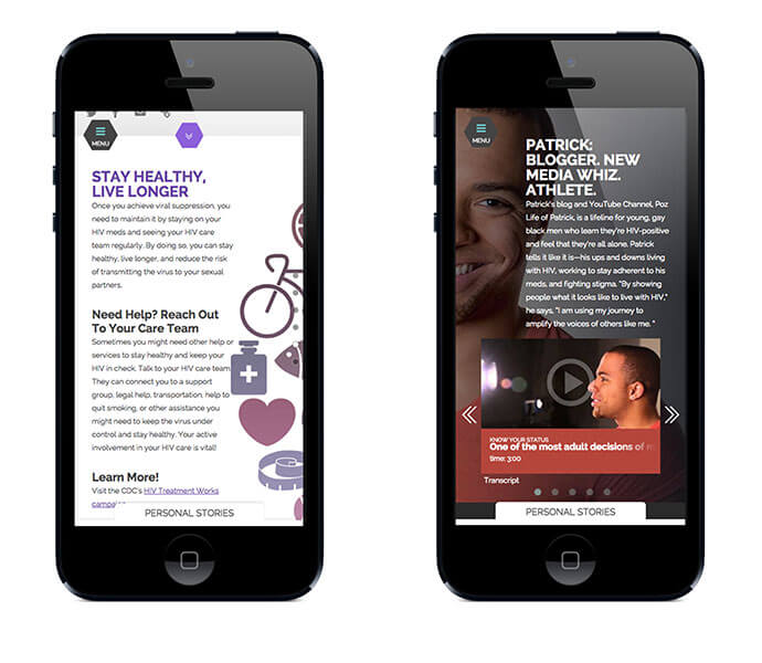
Black gay and bisexual men are disproportionately affected by HIV in the United States. Aside from educating the public about the HIV Continuum of Care, we wanted to feature personal stories of five HIV-positve black men who have successfully navigated through the Continuum and reached viral suppression with short video segments.
Tackling this project was, at first, very challenging. There were a number of objectives the team had to consider. Our target audience was extremely mobile. Usually, with sensitive subjects such as HIV and AIDS, searches for information are conducted on small personal devices. Therefore, our content had to be mobile-friendly and easy to consume. At first, we weren't sure how to direct the user—give them the information first, or show them the video stories? Which was more important to the user?
Other challenges the team faced were how to make the site visually engaging and contemporary, but keeping accessibility in mind. Colors had to provide enough contrast and media players had to have keyboard controls. And while this site was supposed to be uplifting, what was the tone we wanted to set? Surely not laughing faces, but certainly not somber either. Each individual story was filled with emotional moments, but all our featured men were happy with their lives.
We went through a few rounds of user testing and focus groups during the process to make sure we were on track with how we wanted the site to look and function. In the end, we were able to experiment with alternate forms of navigation. One in which the user would be able to access either content on each individual stage of the Continuum, or follow one of the personal stories of the men. Both of which would be persistent.
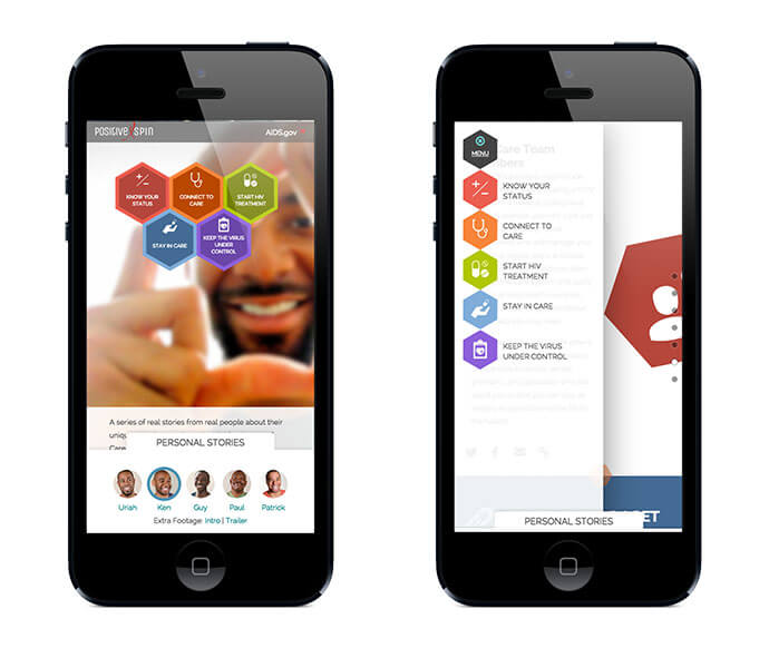
Content was grouped with colorful graphics and broken up into different panels to help the user consume the information. Each section was short and to the point, with different headers to give the reader plenty of visual breaks and make the content seem less daunting and dense. If the user chose to follow one of the personal stories, they can load one of the pages and watch all the videos sequentially.
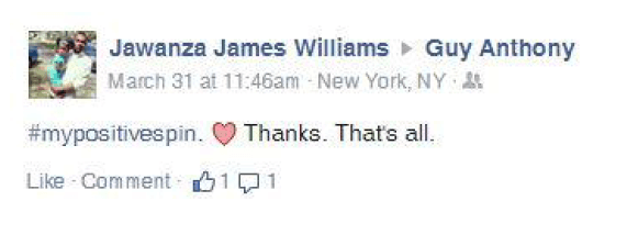
The site launched with an accompanying social media campaign. Within one month, there were 7,500 page views and 2,600 video views, and 259 retweets on twitter. Many people reached out to the guys personally to thank them for sharing their story.
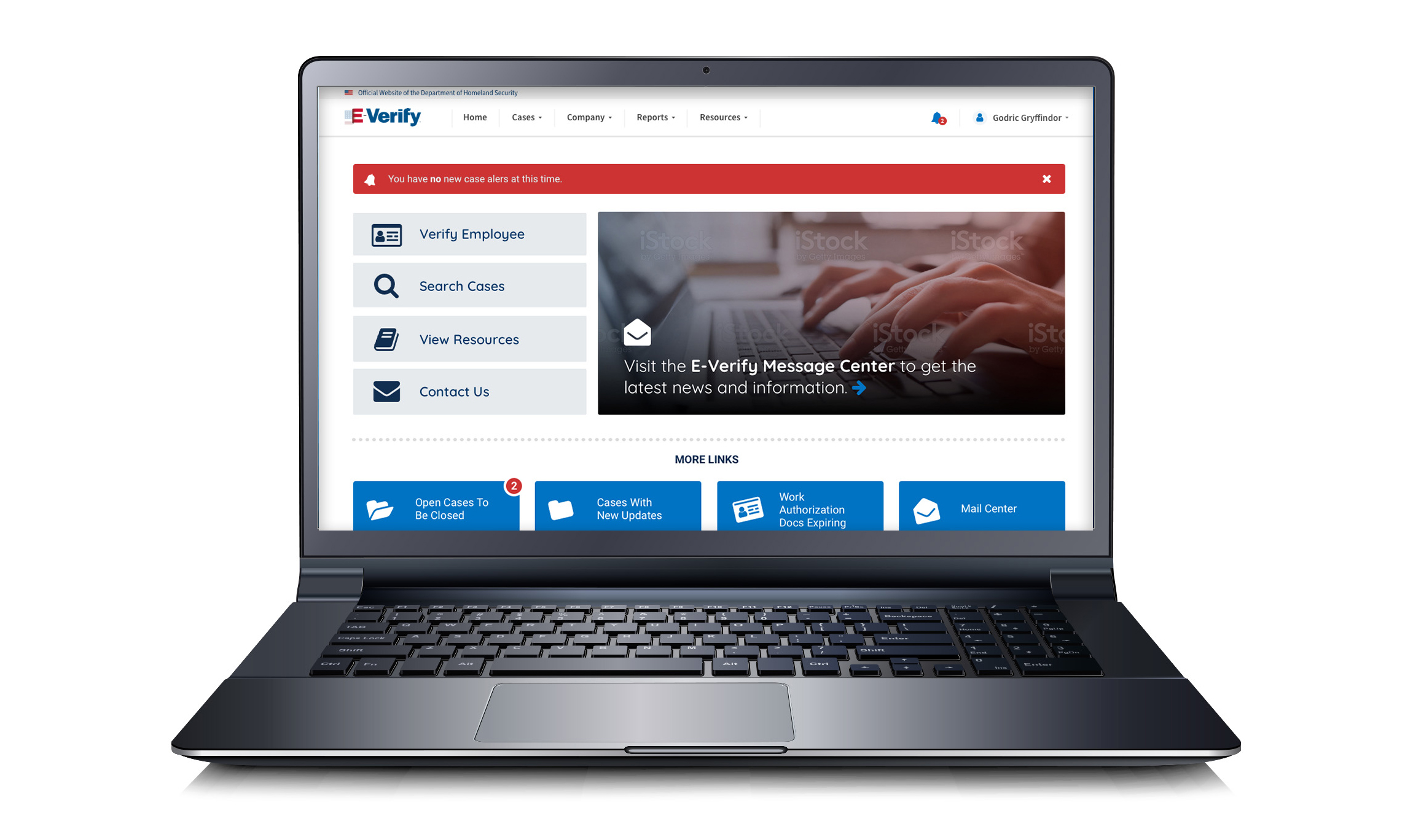
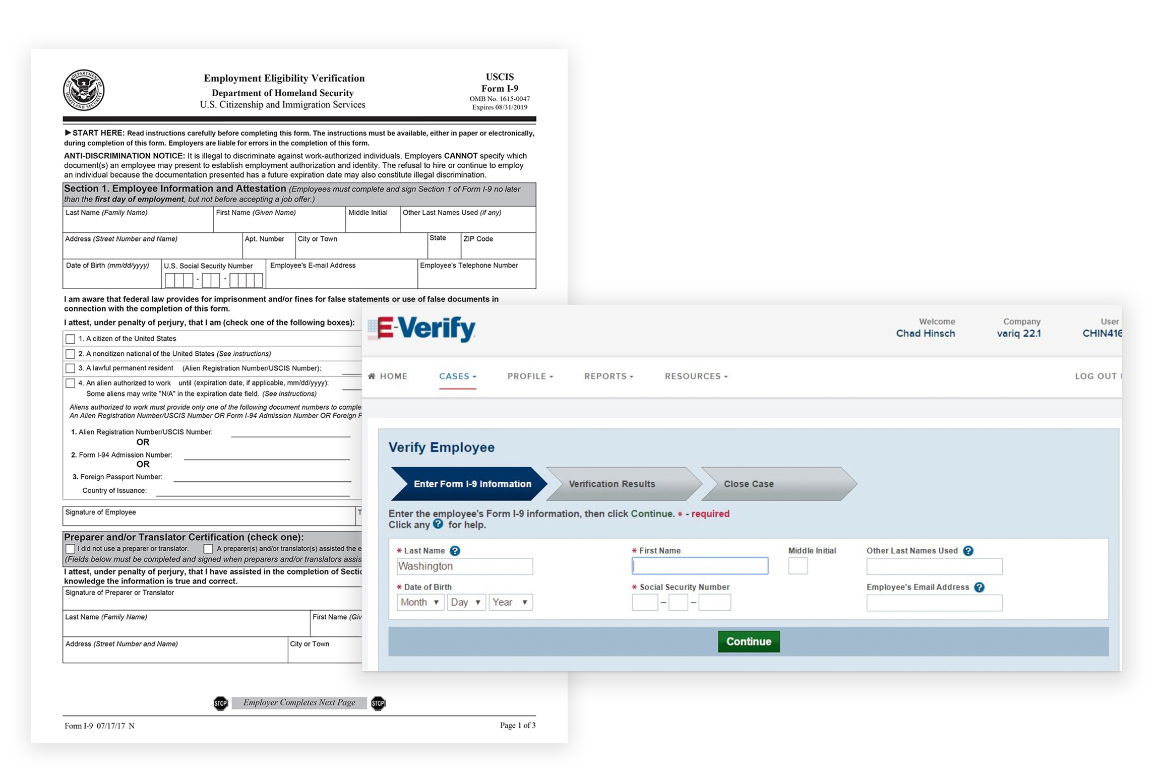
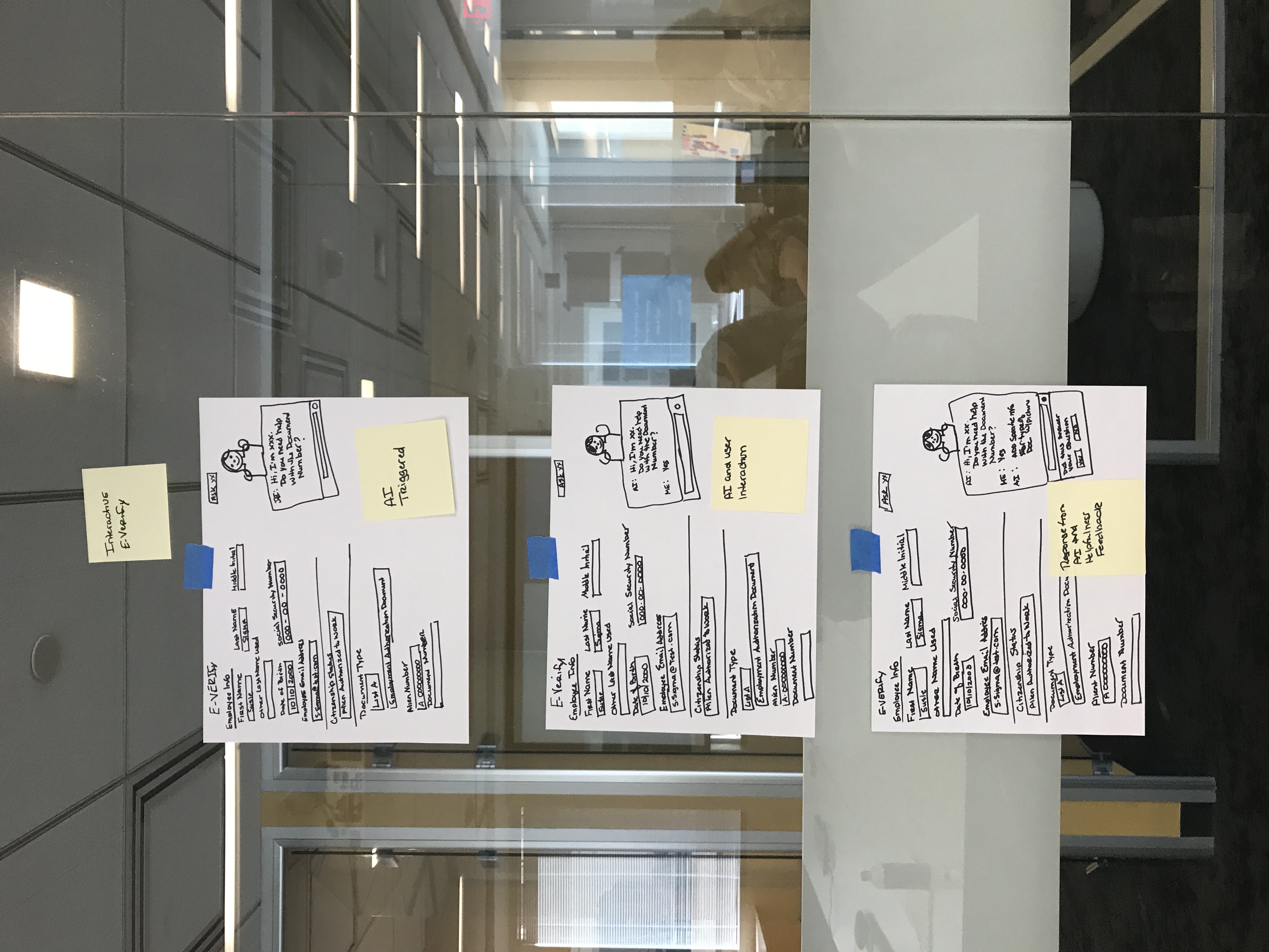
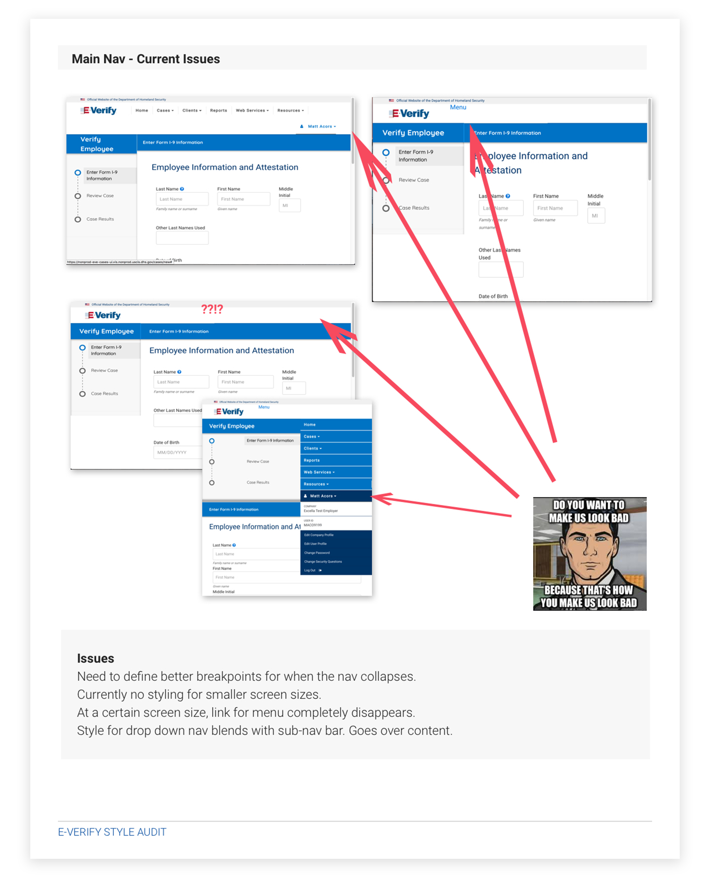
E-Verify is an web-based system that compares information from an employee’s Form I-9 to data from U.S. Department of Homeland Security and Social Security Administration records to confirm employment eligibility. E-Verify is used by almost a million employers ranging from big corporations to small businesses - to verify a person’s eligibility to work in the United States. The system processes over 600,000 new hires per day.
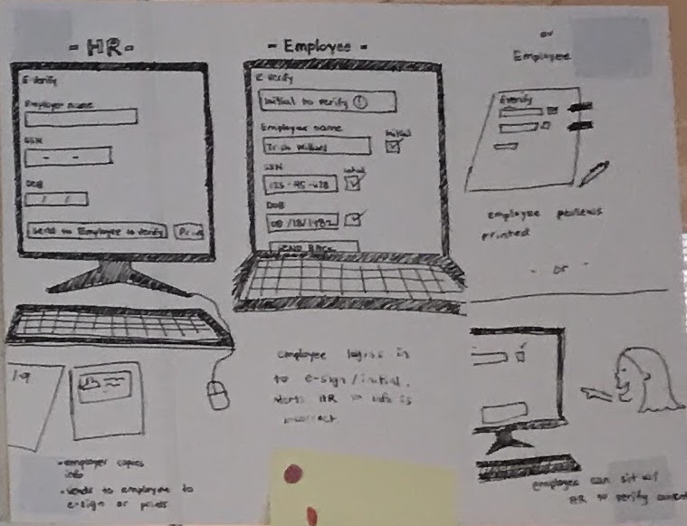
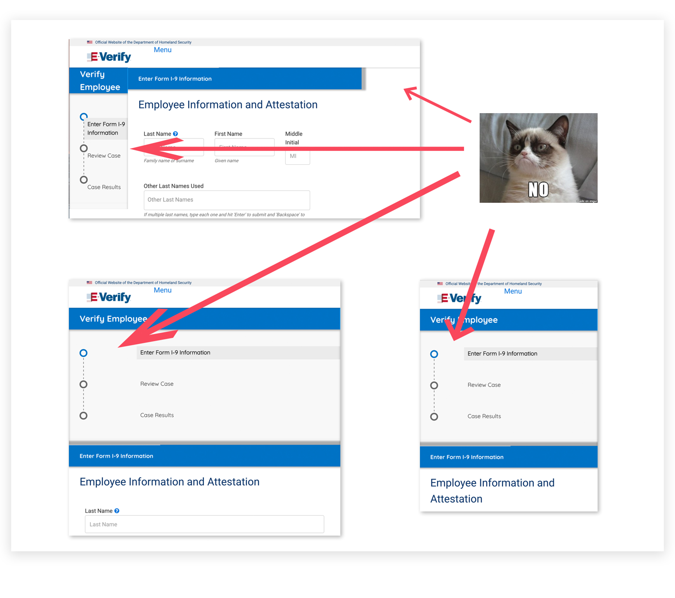
Users would start with a paper copy of an employee's I-9 form and transfer information from the form to the UI, which didn't necessarily follow the order of the fields from the form. Tabbing direction was ambiguous.
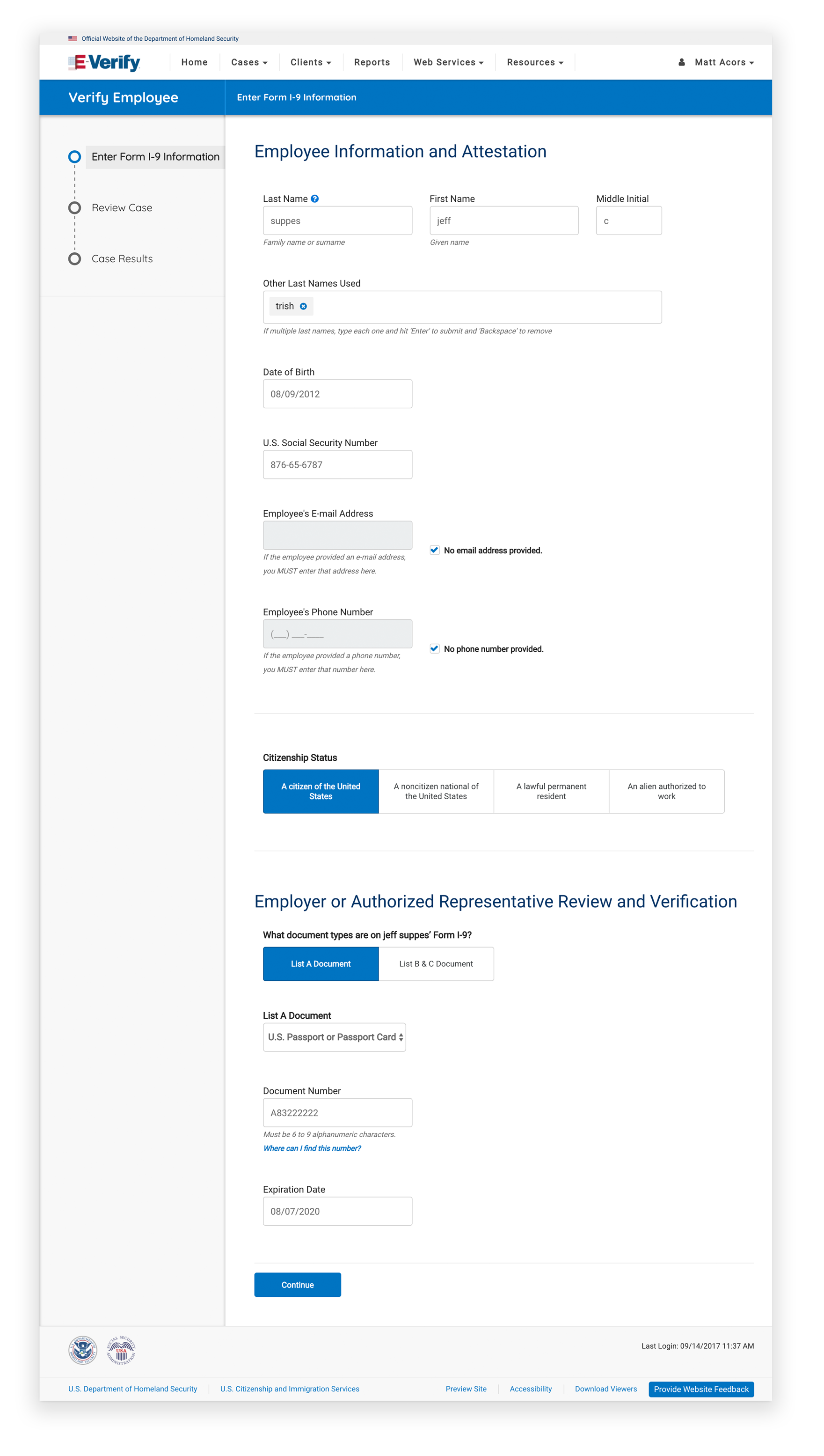
New UI utilized whitespace and large form fields to improve accessibility and make the form feel less overwhelming.
Added in confirmation pages to reassure users that they had one last opportunity to review information and make sure that everything was correct before they submitted.
Side navigational elements were included so the user could see what steps were ahead of them, reducing anxiety about how long the process was. Icons to confirm they’ve successfully completed each section.

Pages also included more plain language instruction to infuse a tone of helpfulness and reduce anxiety. It would be explicit when users need to take no action.
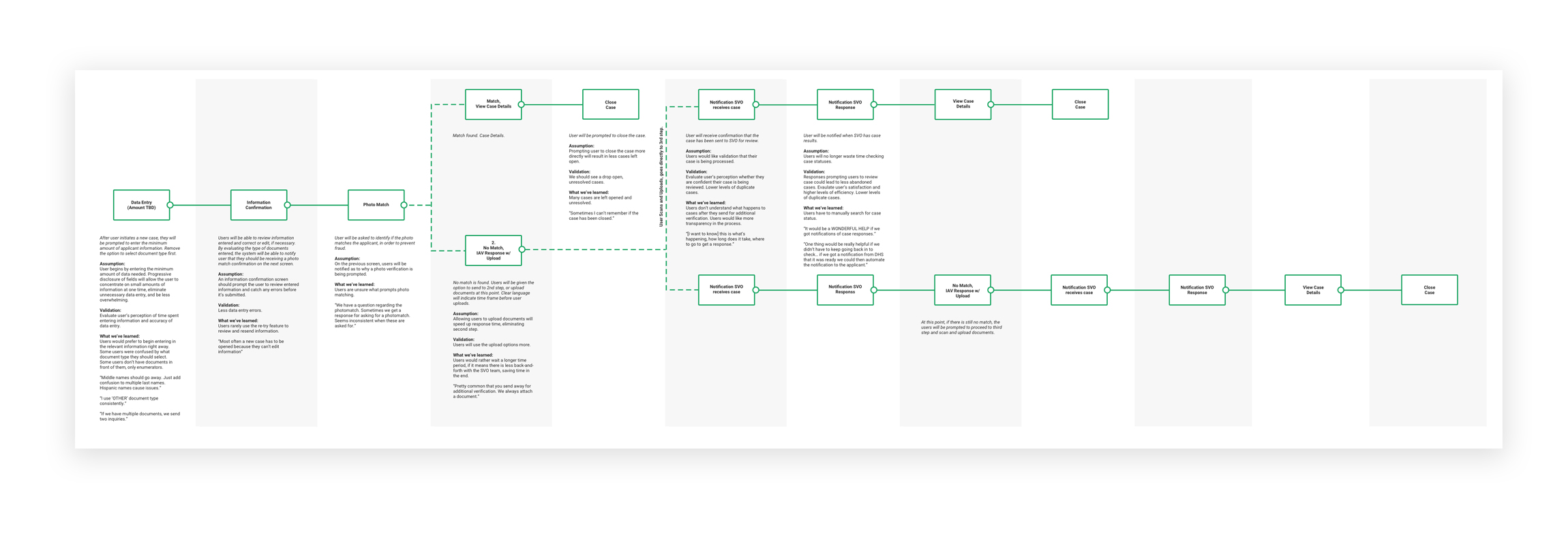
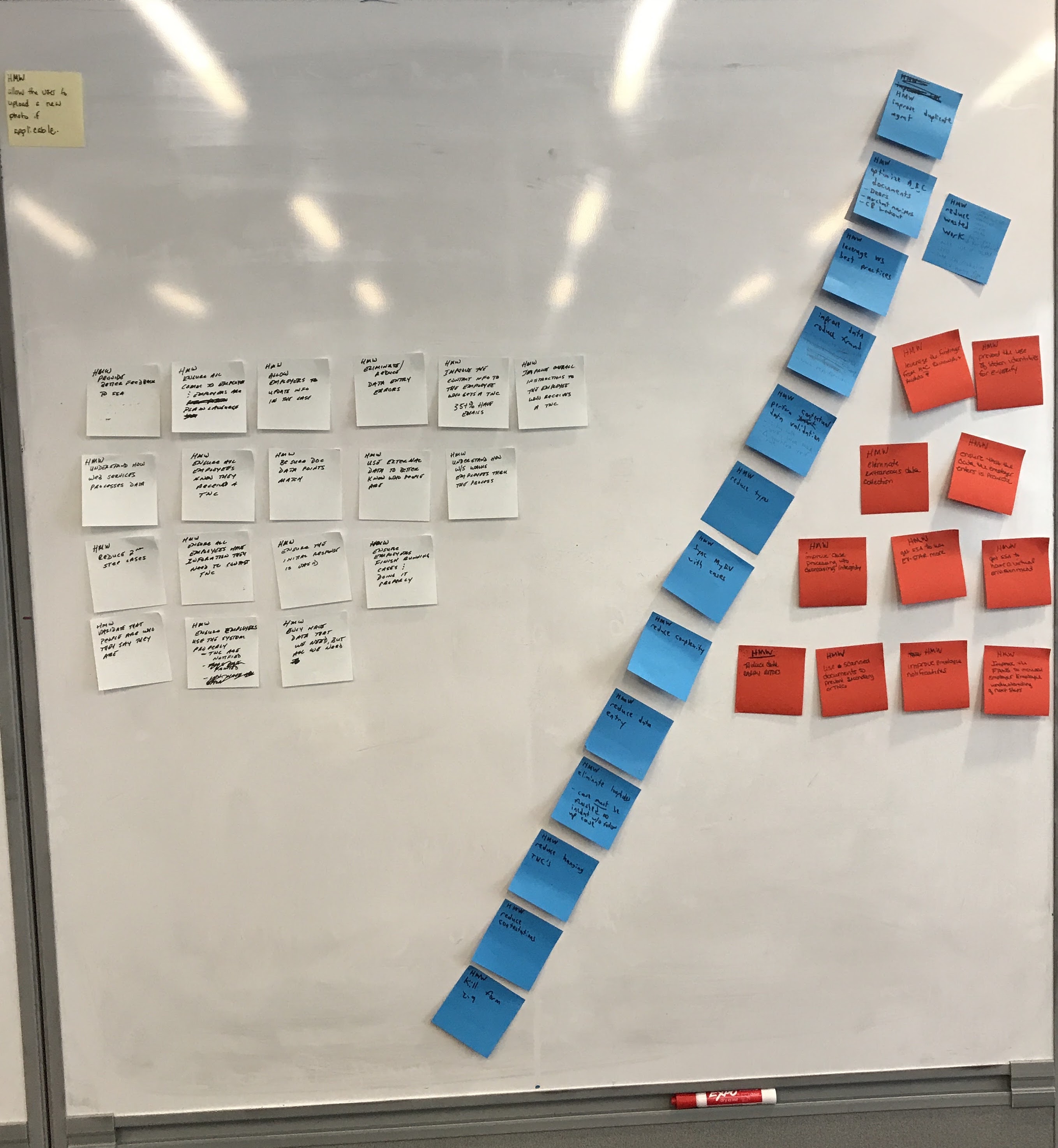
In order to make research-informed recommendations to the UI, a number of research tactics were used, such as usability testing, interviews and observations, journey maps, and design sprints.
Users would start with a paper copy of an employee's I-9 form and transfer information from the form to the UI, which didn't necessarily follow the order of the fields from the form. Tabbing direction was ambiguous.

In the end, we noted that client enrollment average time was now 45% faster and with a decrease of 22.9% abandoned enrollments. E-Verify continues to be one of the highest rated government programs in customer satisfaction. Check out the case study here.
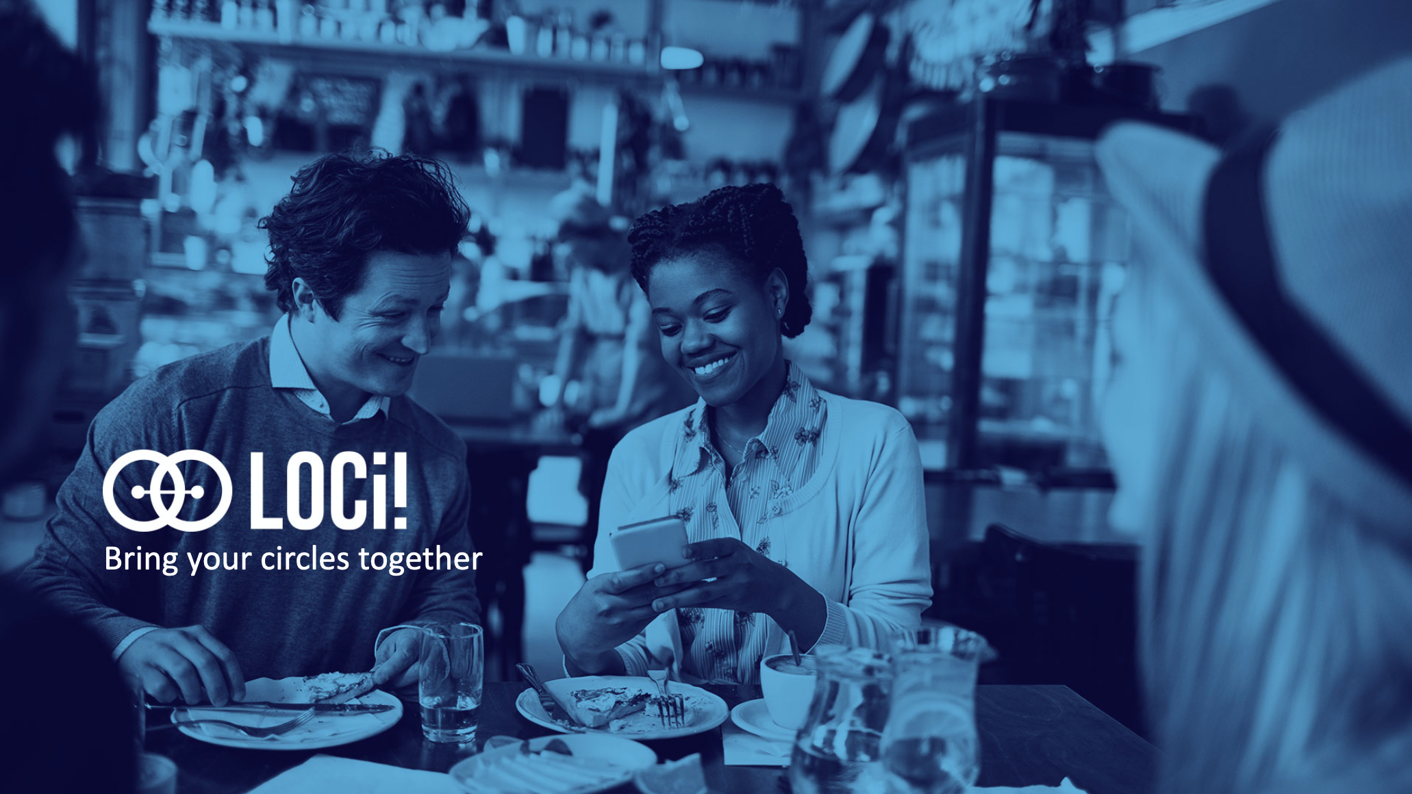
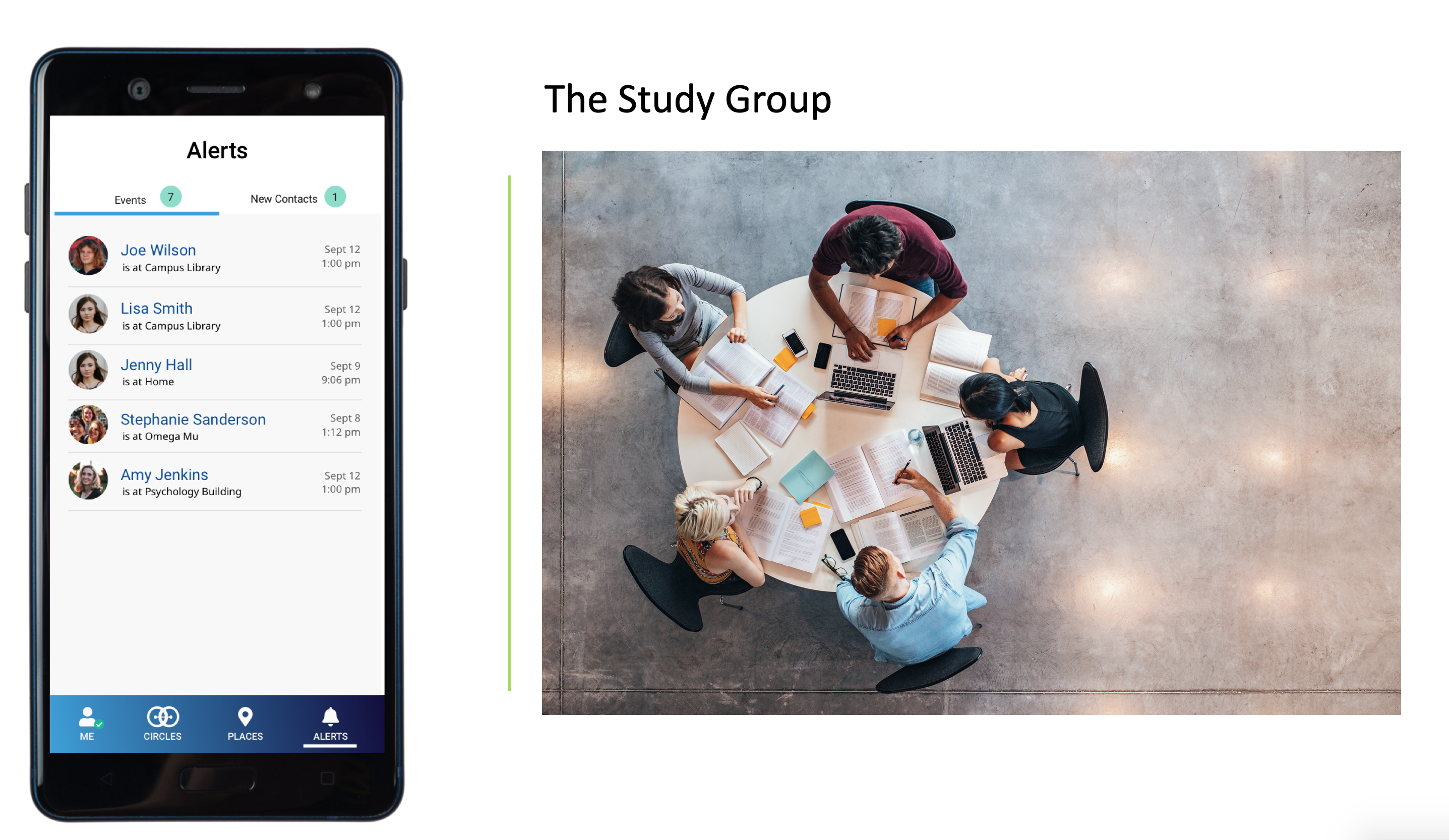
The pandemic placed many locations under "stay at home” orders and adults simultaneously underwent a form of social isolation that is unprecedented in the modern world. But, as humans social interaction is essential to every aspect of our health. Loci is an app that encourages people to get together, inspires social connectivity and spurs spontaneous meet ups.
A privacy centric, geolocation-based mobile app
But Loci is unlike any other location sharing app... because it allows you to selectively organize your contacts into circles. And set rules for who sees what.


Most location-sharing apps have an all-or-nothing mentality. Either you're constantly sharing your location with all your contacts or you're not. With Loci, you can group you contacts by people of similar interest. Say you want to only share with people in your kid's play group when you're at the playground. This will alert the people in your circle that you're at a nearby playground with an open invitation to hang out.

Similarly, if you're taking a course with a small study group, you can alert your classmates that you're at the library or in the common area.
This app was developed over a short 3-month period, from conception to being available in the app store. In order to get our MVP out, we did lots of rapid prototyping and testing.


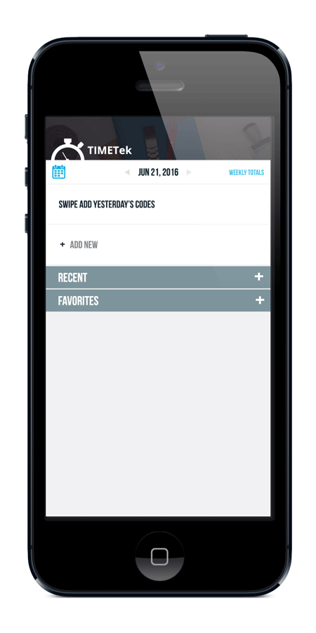
I created this prototype of a timesheet app due to my frustrations with the current software my company uses *ahem ahem sounds awfully similar to timetek*. I used Photoshop to mock everything up and I animated it in AfterEffects. If this were really going to a developer, I would typically use Sketch and Flinto.

For my timesheet app protoype, I actually drew inspiration from food-logging apps, such as MyFitnessPal. Typically, you enter your time in at the end of the day, so I figured the default view should be on a daily basis. Also, because you're probably working on the same codes from the day before, I thought it would be nice to have a quick swipe to add yesterday's codes. In addition to that, I wanted to feature Recent codes and favorites to add to the convenience of adding frequently used codes.
Secondly, I included a "stepper" to add time, or the option to enter it in manually. For the purposes of the demo, the stepper increases the amount of time in half-hour increments. As Luke Wroblewski, a Product Director at Google mentions steppers are great alternatives to drop down menus for mobile users.
I played around with different animations and delays. In general, whenever you can add in an animation with little to no performance cost, I believe it adds to delightfulness of using an app. And, even though they seem merely cosmetic, the codes coming in from the sides hint to the user that the codes are swipeable.
Check out the video for a higher-def look at the prototype:
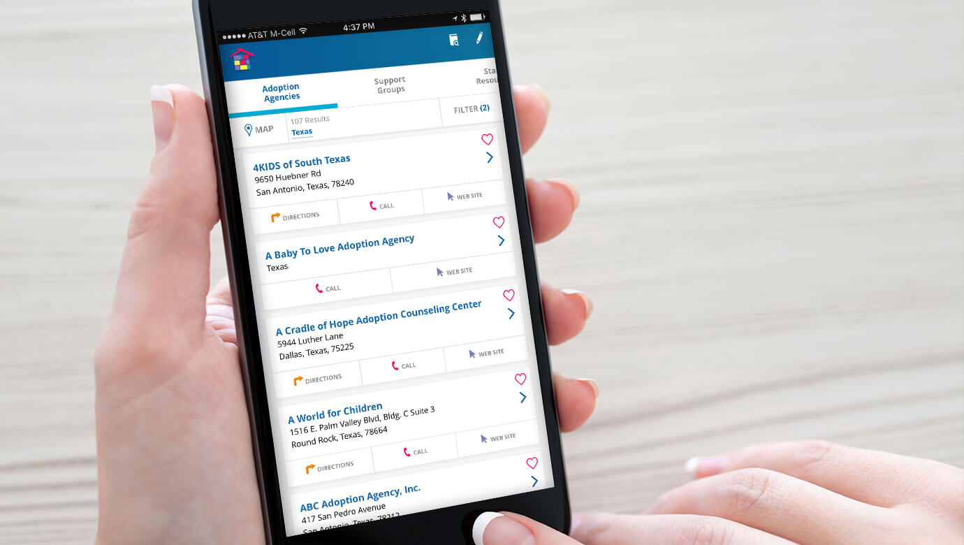


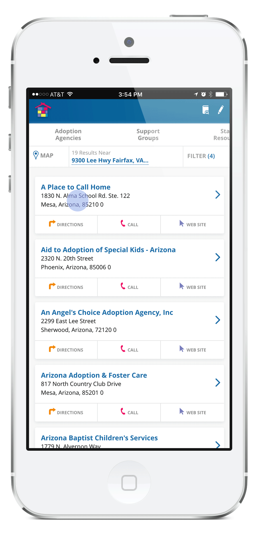
The National Foster Care and Adoption Directory is a tool that was created for the Child Welfare Information Gateway program under the Children's Bureau within the U.S. Department of Health and Human Services. It aims to connect childcare case workers and prospective adoptive parents with adoption agencies and support groups. Our goal when designing the app was to allow users to quickly search by different categories and by location.

When we first started working on the app, we took a look at how the directory was used online. It was clunky, visually unappealing, and pretty confusing. Listings for different agencies were grouped oddly, with the ability to sort by categories without any logical reasoning (why would anyone sort alphabetically by city? Why not within a radius of where the user was?). We thought we could do better and create an easier to understand experience.
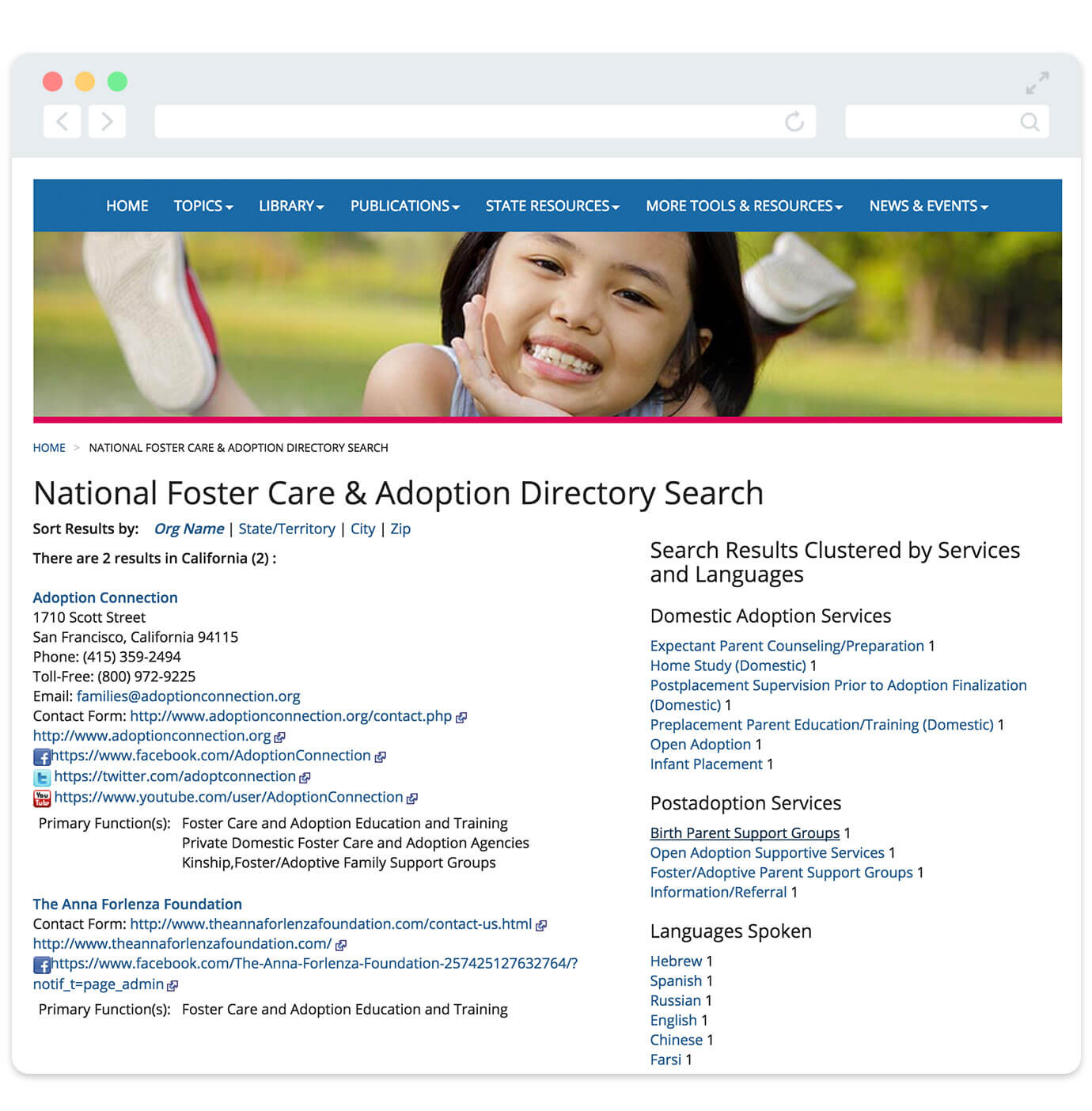
We started by creating categories for different types of organizations - Agencies, Support Groups, State Resources, and State officials. This way the user could quickly drill down to where they wanted to go. We also wanted to steer clear of using the ever-polarizing hamburger menu, so we used a swipeable navigation style, so everything was more apparent and accessible.
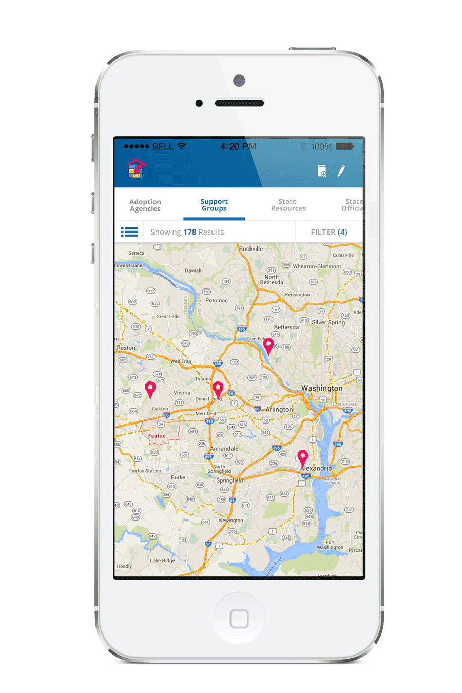
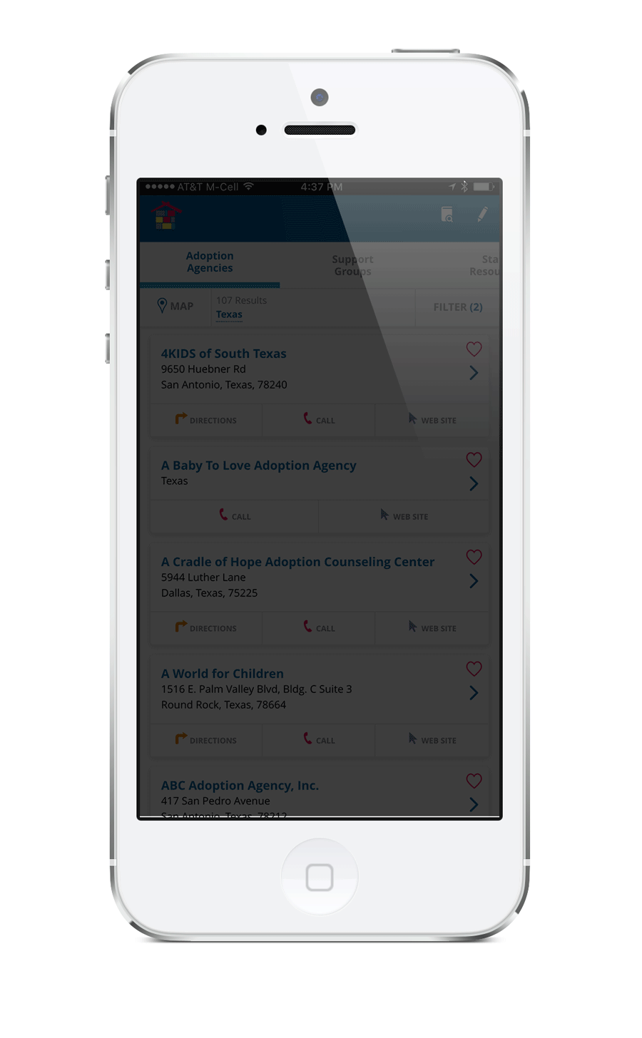
The app offered two different views for each listing. If they didn't want to search via map view, they could also check out the organizations in a card-style listings. When they touched a card, it would take them to a detailed view. There was also a filter function in case the user was looking for specific services.
We also added a pull-to-refresh animation to the app. Although there probably aren't going to be a lot of changes to listings while a person uses the app, but we figured this would be a delightful easter egg. Originally, we thought it'd be nice to do a flying stork bringing home a baby:
But the client said they wanted to concentrate less on babies, and more on the idea of paths being brought together. They sent this for inspiration.

While I thought those were fantastic ideas, I reinterpreted their concepts and created this animation instead. Something along the lines of coming together to bring love into a home.

In the end, the client was extremely pleased, not just with the animation and bits of flourishes, but with the ease at which they could use the app and navigate though the listings.
The National Foster Care and Adoption Directory is a tool that was created for the Child Welfare Information Gateway program under the Children's Bureau within the U.S. Department of Health and Human Services. It aims to connect childcare case workers and prospective adoptive parents with adoption agencies and support groups. Our goal when designing the app was to allow users to quickly search by different categories and by location.
When we first started working on the app, we took a look at how the directory was used online. It was clunky, visually unappealing, and pretty confusing. Listings for different agencies were grouped oddly, with the ability to sort by categories without any logical reasoning (why would anyone sort alphabetically by city? Why not within a radius of where the user was?). We thought we could do better and create an easier to understand experience.
We started by creating categories for different types of organizations - Agencies, Support Groups, State Resources, and State officials. This way the user could quickly drill down to where they wanted to go. We also wanted to steer clear of using the ever-polarizing hamburger menu, so we used a swipeable navigation style, so everything was more apparent and accessible.
The app offered two different views for each listing. If they didn't want to search via map view, they could also check out the organizations in a card-style listings. When they touched a card, it would take them to a detailed view. There was also a filter function in case the user was looking for specific services.
We also added a pull-to-refresh animation to the app. Although there probably aren't going to be a lot of changes to listings while a person uses the app, but we figured this would be a delightful easter egg. Originally, we thought it'd be nice to do a flying stork bringing home a baby:
But the client said they wanted to concentrate less on babies, and more on the idea of paths being brought together. They sent this for inspiration.
While I thought those were fantastic ideas, I reinterpreted their concepts and created this animation instead. Something along the lines of coming together to bring love into a home.
In the end, the client was extremely pleased, not just with the animation and bits of flourishes, but with the ease at which they could use the app and navigate though the listings.

Hello! I'm Trish, a UI/UX Designer based out of the Washington, D.C. area. For over 15 years, I've had the priviledge of working with some amazing people on very impactful projects...with sometimes very vulnerable users. Whether it's teens that are addicted to smoking, people living with HIV, or military operations fighting critical missions overseas—working on projects that make a difference has been incredibly fulfilling.
I consider modern web design a balance of both my love of art and creativity with logic and organization. I like to think I do more than make stuff pretty. I'm a problem solver and an analytical thinker. Finding creative solutions to maximize a user's experience is thrilling (I know I'm a nerd). ...And I enjoy creating little animations and prototyping microinteractions. I'm an advocate for seamless and intuitive user experiences. I like to create end-to-end experiences—from conception (meeting with users, clients, and developers) to wireframes and prototypes, and finally, to polished, visually stunning products (with lots of iteration and testing along the way).
Recently, I've been trying to improve my front-end skills as well. I initially taught myself HTML back in the Geocities days (yes, I'm that old), but have been trying to get better at javascript. In fact, I built this site, what do you think?
If you want to talk me about design, find what's on my current book list, or talk glasses, feel free to send me an email or connect with me on LinkedIn.